

By Tiffany Burbidge
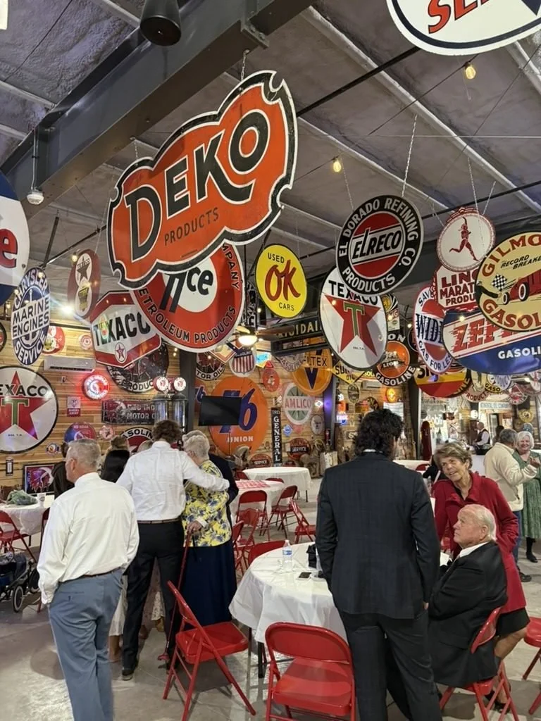
TLDR: Pick two main colors and one metallic, and repeat them on every table. Winter palettes such as white, silver and icy blue suit teams with mixed beliefs, and deep red with gold reads as classic without looking loud. At Sparks Museum and Event Center the room already mixes white, red, black and yellow with colorful neon, so a calm table palette, or one that repeats one or two of those colors, looks better than a table with five colors of its own.
Your committee has a theme channel with 40 messages in it and no decision. One person wants red and green, another wants black and gold, and someone from finance wants the company blue on everything. The table colors are the part guests notice first and photograph most, so they are worth settling early.
What colors work best for a corporate holiday party?
Two main colors plus one metallic work best for most corporate holiday tables. That is enough to look planned and few enough to repeat on every table without the room looking busy.
These palettes are easy to buy for and easy to match:
| Palette | Feel | Good for |
|---|---|---|
| Deep red, forest green, gold | Classic Christmas | Teams that celebrate Christmas together |
| Burgundy, cream, gold | Warm and formal | Seated dinners and awards nights |
| Black, white, gold | Upscale | Evening parties and year-end galas |
| White, silver, icy blue | Winter | Mixed teams and January parties |
| Navy, silver, white | Calm winter | Brands with blue in the logo |
| Evergreen, cream, copper | Cozy | Casual mixers and lunches |
Pick the metallic first if you already own pieces. A box of gold ornaments from last year decides the palette for you and saves money.
Which palettes work for a team with mixed beliefs?
Winter palettes work best for a team with mixed beliefs, because snow, frost and evergreen belong to the season rather than to one holiday. White, silver and icy blue is the safest choice. Navy and silver or evergreen and cream also work.
Keep the symbols general too. Snowflakes, pinecones, battery candles and stars fit almost any team. If your company calls it a holiday party or a year-end party on the invitation, carry that choice onto the tables so the message matches.
How do you match table colors to the venue?
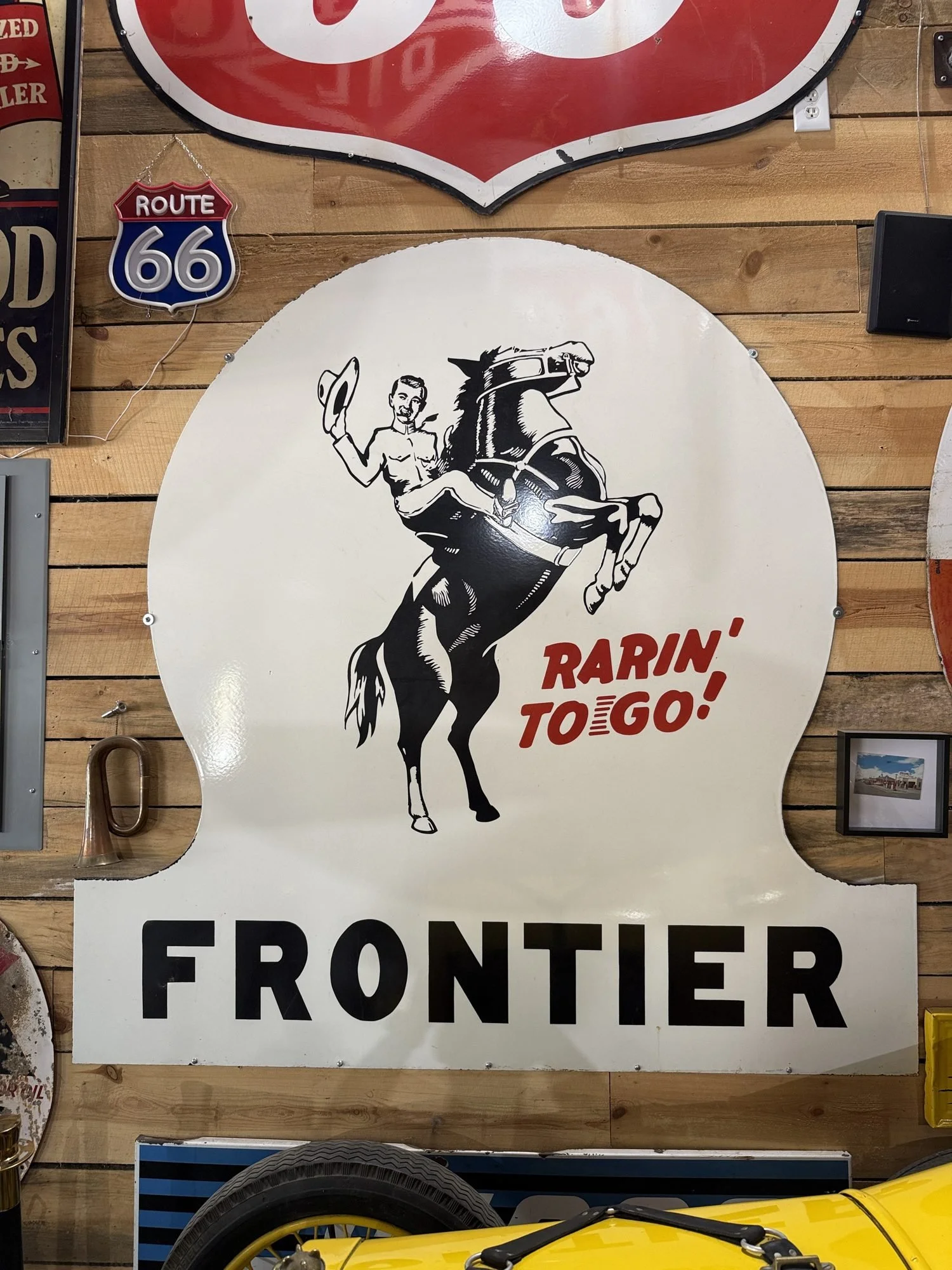
Look at the room first, because you cannot change it. At Sparks Museum and Event Center, there is no single dominant color. The room is a mix of white, red, black and yellow, with colorful neon signs on top. The 5,000 square foot floor is a museum of petroliana, with vintage signs, antique gas pumps and classic cars, and the displays are fixed in place, so they look the same for every event.
That mix gives you two honest choices.
Echo the room. Pull one or two of the room's own colors onto the tables. The tables look like they belong in the space.
Red, white and gold. Repeats the red and white already on the walls. Gold sits close to the yellow without matching it. This is the easiest classic Christmas look in this room.
Black, white and gold. Repeats the black and white and reads as formal. It works well for an awards night.
Red, black and silver. A bolder, retro look that leans into the vintage signs. Keep it to ribbon, napkins and table numbers so it does not get heavy.
Red, yellow and white. The full vintage sign palette. Use it only for a retro theme, and keep white as the main color so the tables stay calm.
Calm the room. Choose colors the room does not use, kept soft, so the tables give the eye a rest from the neon.
Icy blue and white with silver. Blue is not part of the room's mix, so it stands apart cleanly. It also suits mixed teams.
Evergreen, cream and copper. Fresh greenery and pine garland are allowed on the tables, as long as nothing is stuck to the antiques or cars. Green plus cream reads warm next to the neon.
What to avoid: a rainbow table. Five bright colors on the tables plus the room's own red, yellow, black, white and neon is too much at once, and it washes out in photos.
Lighting changes how colors look. The lights and neon can be partly turned off to set a mood, and the neon signs can be turned on or off. The room cannot go completely dark, because the museum's valuables need some light. Check your samples under the lighting you plan to use, since gold and cream look warmer in low light and icy blue can look gray.
What table themes go with each palette?
A table theme is a palette plus two or three repeated pieces. You do not need a full party theme to decorate the tables. For whole-party themes, see how to pick a corporate Christmas party theme.
Winter white. White and silver with icy blue. Clear ornaments in glass bowls, white battery candles and silver table numbers.
Black and gold. Black runners, gold ornaments and framed gold table numbers. It photographs well at night.
Classic Christmas. Red and white with gold. Plaid ribbon, small wrapped boxes, pinecones and a short run of pine garland.
Cozy cabin. Evergreen and cream with copper. Pinecones, fresh greenery, knit or burlap runners and small lanterns with battery candles.
Retro holiday. Red, yellow and white, with bright ornaments, old holiday postcards as table cards and diner-style menus. The vintage twist post has more ideas for that angle.
Candles in every theme should be battery candles, because decor and centerpiece candles must be battery-operated. Skip confetti and glitter too. They are not allowed, because they cause problems for the antiques. Metallic ornaments, ribbon and battery fairy lights give the same sparkle without the mess.
You can carry a theme above the tables. Hanging decor is allowed if it is secured with blue painter's tape and taken down at the end of the event. Never attach anything to the signs, gas pumps or cars.
How do you add brand colors without it looking like a trade show?
Use your brand color as the accent and let the holiday palette carry the rest. One brand color in ribbon, napkins or table numbers is enough for people to notice.
A few ways to do it:
Tie ribbon in the brand color around a neutral centerpiece.
Print table numbers or trivia cards on brand-colored cardstock.
Pair the brand color with a metallic. Navy brands go well with silver. Red brands go well with gold and already match the red in the room.
Keep logos off the centerpieces. Put one logo on the welcome sign or the photo backdrop instead.
If your brand color is hard to match, such as lime green or orange, use it only in small pieces and let white, cream or a metallic fill the table.
How much linen color do you need to order?
Linens set most of the color on a table, so order them by count. Linens are extra at Sparks Museum and Event Center, and the preferred vendor is Specialty Linens. Ask them which colors they carry for each size.
The venue has 30 six-foot round tables that seat 8 each, plus 4 eight-foot and 3 six-foot rectangular tables. A party of 120 uses 15 rounds. Add the rectangles you use for food, drinks and gifts. White or cream linens on every table, with your palette in runners and napkins, is the most flexible order. Colored linens make a bigger statement, and in this room black or red linens will repeat what is already on the walls.
FAQ
Is red and green too traditional for a work party?
No, if your team celebrates Christmas together. Burgundy and forest green with gold looks less loud than bright red and green.
What colors are already in the room?
There is no single dominant color. The room mixes white, red, black and yellow, with colorful neon signs.
Do linens come in custom colors?
Linens are extra, through the preferred vendor Specialty Linens. Ask them which colors they carry.
Can the neon be turned off?
Yes. The neon signs can be turned on or off, and the lights can be partly turned off. The room cannot go completely dark because of the museum's valuables.
Can we put decor on the cars?
No. Nothing goes on the signs, gas pumps or cars. The cars are roped off, and guests can be around them.
Can we hang theme decor from the ceiling?
Yes. Hanging decor is allowed if it is secured with blue painter's tape and removed at the end of the event.
Two colors and one metallic, repeated on every table, will look finished without a big budget. In a room that already mixes red, white, black, yellow and neon, either repeat one or two of those colors or go calm with white, silver and blue, and skip the rainbow. Use a winter palette if your team has mixed beliefs, keep the brand color to the accents and check every sample under the lighting you plan to use. For what you can attach and where, see the flexible decorating guide.
Bring your linen swatch and one ornament to a venue tour, and hold them up next to the neon signs and the white, red, black and yellow decor before you order anything. Check your date and book a tour at Sparks Museum and Event Center.
We support venues across the country and would love for you to see what is out there across the country. Here are some of our favorites.